Exploratory Data Analysis on the Student Alcohol Consumption dataset (Code)
This post is an execution of the explanations from this blog post. This analysis was done as part of fulfilling the Data Mining course in Multimedia University. People who contributed to this were Aaron Patrick Nathaniel, Lim Yue Hng (Neil) and Nicolas Raj.
Libraries and loading the .csv file
The .csv file we chose to explore is student-mat.csv
library(plotly)
library(gridExtra)
library(reshape2)
library(plyr)
library(dplyr)
df <- read.csv("student-mat.csv", header = TRUE)
Preprocessing - Checking For Special Values
We used a function to check if the values in the dataset contain any special values. After running the function, we found out that there were no special values in the entire dataset. Thus, no cleaning is required.
is.special <- function(x){
  if (is.numeric(x)) !is.finite(x) else is.na(x)
}
head((data.frame(sapply(df, is.special))))
## school sex age address famsize Pstatus Medu Fedu Mjob Fjob
## 1 FALSE FALSE FALSE FALSE FALSE FALSE FALSE FALSE FALSE FALSE
## 2 FALSE FALSE FALSE FALSE FALSE FALSE FALSE FALSE FALSE FALSE
## 3 FALSE FALSE FALSE FALSE FALSE FALSE FALSE FALSE FALSE FALSE
## 4 FALSE FALSE FALSE FALSE FALSE FALSE FALSE FALSE FALSE FALSE
## 5 FALSE FALSE FALSE FALSE FALSE FALSE FALSE FALSE FALSE FALSE
## 6 FALSE FALSE FALSE FALSE FALSE FALSE FALSE FALSE FALSE FALSE
## reason guardian traveltime studytime failures schoolsup famsup paid
## 1 FALSE FALSE FALSE FALSE FALSE FALSE FALSE FALSE
## 2 FALSE FALSE FALSE FALSE FALSE FALSE FALSE FALSE
## 3 FALSE FALSE FALSE FALSE FALSE FALSE FALSE FALSE
## 4 FALSE FALSE FALSE FALSE FALSE FALSE FALSE FALSE
## 5 FALSE FALSE FALSE FALSE FALSE FALSE FALSE FALSE
## 6 FALSE FALSE FALSE FALSE FALSE FALSE FALSE FALSE
## activities nursery higher internet romantic famrel freetime goout Dalc
## 1 FALSE FALSE FALSE FALSE FALSE FALSE FALSE FALSE FALSE
## 2 FALSE FALSE FALSE FALSE FALSE FALSE FALSE FALSE FALSE
## 3 FALSE FALSE FALSE FALSE FALSE FALSE FALSE FALSE FALSE
## 4 FALSE FALSE FALSE FALSE FALSE FALSE FALSE FALSE FALSE
## 5 FALSE FALSE FALSE FALSE FALSE FALSE FALSE FALSE FALSE
## 6 FALSE FALSE FALSE FALSE FALSE FALSE FALSE FALSE FALSE
## Walc health absences G1 G2 G3
## 1 FALSE FALSE FALSE FALSE FALSE FALSE
## 2 FALSE FALSE FALSE FALSE FALSE FALSE
## 3 FALSE FALSE FALSE FALSE FALSE FALSE
## 4 FALSE FALSE FALSE FALSE FALSE FALSE
## 5 FALSE FALSE FALSE FALSE FALSE FALSE
## 6 FALSE FALSE FALSE FALSE FALSE FALSEPreprocessing - Finding Outliers In Grades
Now we want to check for outliers in the columns which has their First Period Grade (G1), Second Period Grade (G2) and Final Period Grade (G3) with respect to their workday alcohol consumption (Dalc). We want to pay more attention to G3’s boxplot because we think that for students, their final grade is all that matters and that they will put in more effort for a good final grade compared to a first period or second period grade.
boxplot1 <- ggplot(df, aes(x=Dalc, y=G1, fill=Dalc))+
  geom_boxplot(aes(group = Dalc))+
  theme_bw()+
  xlab("Alcohol consumption")+
  ylab("First period grade")+
  ggtitle("First period grade") + theme(legend.position = "none")

boxplot2 <- ggplot(df, aes(x=Dalc, y=G2, fill=Dalc))+
  geom_boxplot(aes(group = Dalc))+
  theme_bw()+
  xlab("Alcohol consumption")+
  ylab("Second period grade")+
  ggtitle("Second period grade") + theme(legend.position = "none")

boxplot3 <- ggplot(df, aes(x=Dalc, y=G3, fill=Dalc))+
  geom_boxplot(aes(group = Dalc))+
  theme_bw()+
  xlab("Alcohol consumption")+
  ylab("Final period grade")+
  ggtitle("Final period grade") + theme(legend.position = "none")

grid.arrange(boxplot1, boxplot2, boxplot3, ncol = 3)
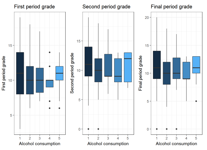
There seems to be many outliers in G3’s data.
Comparing mean grades of G1, G2 and G3 with respect to Dalc
We will now compare the mean grades of G1, G2 and G3 with respect to the workday alcohol consumption levels (Dalc). Our main focus will again be G3. When you hover over the bar chart, please ignore the Dalc values. The values of Dalc for each group of bar chart is supposed to be the same.
toPlot <- group_by(df, Dalc) %>% summarize(G1Mean = mean(G1), G2Mean = mean(G2), G3Mean = mean(G3))
toPlot.m <- melt(toPlot,id.var="Dalc")
colnames(toPlot.m)[3] <- "MeanGradeMarks"
ggplotly(ggplot(toPlot.m, aes(x=Dalc, y=MeanGradeMarks, fill=variable)) + geom_bar(position="dodge",stat="identity") + ggtitle("Workday Alcohol Consumption Levels (Dalc) against Mean Grade Marks"))
It seems that the mean grades for G3 for those that consume alcohol at the lowest level (1) are quite close to those that consume alcohol at the highest level (5). Why is that so?
table(df$Dalc, df$G3)## 0 4 5 6 7 8 9 10 11 12 13 14 15 16 17 18 19 20
## 1 26 0 3 13 6 18 17 36 35 20 19 22 29 12 4 10 5 1
## 2 11 1 2 2 1 10 4 12 8 7 4 4 4 2 1 2 0 0
## 3 1 0 0 0 2 2 4 7 1 2 3 1 0 2 1 0 0 0
## 4 0 0 1 0 0 1 3 0 1 1 2 0 0 0 0 0 0 0
## 5 0 0 1 0 0 1 0 1 2 1 3 0 0 0 0 0 0 0ggplot(df, aes(x=Dalc, y=G3, color = Dalc))+ geom_jitter() + scale_colour_gradientn(colours=rainbow(4))
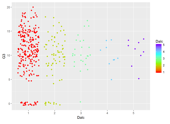
Looks like that there is an abnormal number of students who have a Dalc of 1 and have G3 values of 0. This has decreased the mean value of G3 significantly when Dalc = 1. However, we cannot remove these values because we cannot be sure if those values are errors or the truth. There may be other factors unrelated to alcohol consumption which is affecting the students’ grades.
Associating Family Relationship With Alcohol Consumption Levels
As stated in the previous section, our hypothesis is that people who have bad family relationships tend to drink more. Let us check if our hypothesis holds somewhat true.
toPlot2 <- group_by(df, famrel) %>% summarize(WorkdayAlcoholConsumption = mean(Dalc), WeekendAlcoholConsumption = mean(Walc))
toPlot2.m <- melt(toPlot2, id.var = "famrel")
colnames(toPlot2.m)[3] <- "AlcoholMean"
ggplotly(ggplot(toPlot2.m, aes(x=famrel, y=AlcoholMean, color = variable)) + geom_line() + geom_point() + ggtitle("Family Relationship against Mean Alcohol Consumption"))As we can see, the general trend is a decreasing trend as family relationship (famrel) increases. This would infer that when students have a close relationship with their family members, their levels of alcohol consumption (no matter if it is a workday alcohol consumption or weekend alcohol consumption) will decrease.
Associating Relationship Status With Alcohol Consumption Levels
Based on the research we mentioned in the previous section, people with an intimate relationship with their significant other should have lower alcohol consumption levels. However, our dataset only states whether or not the student has a romantic partner. This does not represent the level of intimacy between them. This relationship is made with the assumption that their level of intimacy is high.
toPlot3 <- group_by(df, romantic) %>% summarize(WorkdayAlcocholConsumption = mean(Dalc), WeekendAlcoholConsumption = mean(Walc))
toPlot3.m <- melt(toPlot3, id.var = "romantic")
colnames(toPlot3.m)[1] <- "RelationshipStatus"
colnames(toPlot3.m)[3] <- "AlcoholMean"
toPlot3.m[1] <- apply(toPlot3.m[1], 1, function(x) {ifelse(x == 'yes', 'Couple', 'Single')})
ggplotly(ggplot(toPlot3.m, aes(x=variable, y=AlcoholMean, fill=RelationshipStatus)) + geom_bar(position="dodge",stat="identity") + ggtitle("Relationship Status against Mean Alcohol Consumption"))The level of alcohol consumption for students who have romantic partners (Couple) are similar to those without romantic partners (Single). There is only a 0.03 difference between the mean alcohol level consumption between couples and singles in both workday alcohol consumption and weekend alcohol consumption with couples being the leader in the former and singles being the leader in the latter.
This could mean that we should not take romantic relationships in high school to be as intimate as adult relationships. From our dataset, there is no significant difference in alcohol consumption levels with relationship status.
Associating Health With Alcohol Consumption Levels
In the previous section we made the guess that people who are not healthy (health = 1) would drink less than people who are healthy (health = 5) to prevent their health from deteriorating even further.
toPlot4 <- group_by(df, health) %>% summarize(WorkdayAlcoholConsumption = mean(Dalc), WeekendAlcoholConsumption = mean(Walc))
toPlot4.m <- melt(toPlot4, id.var = "health")
colnames(toPlot4.m)[3] <- "AlcoholMean"
ggplotly(ggplot(toPlot4.m, aes(x=health, y=AlcoholMean, color = variable)) + geom_line() + geom_point() + ggtitle("Health against Mean Alcohol Consumption"))Although our initial guess holds true, the graph is not a constant increasing trend for both the workday alcohol consumption and weekend alcohol consumption. However, it cannot be denied that for the most part, people who are healthy consume higher level of alcohol.
The R Script for the exploratory exercise can be found here.